
Download and subscribe on Apple Podcasts, Stitcher or TuneIn
Art Matters is the podcast that brings together popular culture and art history, hosted by Ferren Gipson.
How often do you think about maps? You probably use a map application on your phone when you're going to a new place. Maybe you can recall using paper maps years ago on a road trip. They are a practical tool to help us get from one place to another, but they are not neutral.
'I think the earliest surviving maps are from the Babylonian era and the clay tablet from Mesopotamia, which shows a map of a locality,' says Nick Millea, the Map Librarian for the Bodleian Libraries. 'Nothing as a conventional map, as we might think, really survives until the Renaissance ... Some [Islamic and Chinese maps] that survive are even earlier than surviving Western maps.'
Possibly the oldest surviving map
25,000 BC, engraving on a mammoth tusk, discovered in Pavlov in the Czech Republic 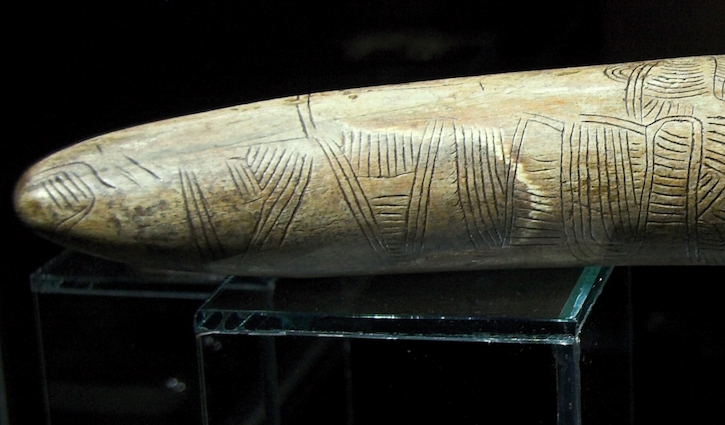
We often think of maps as offering a two-dimensional bird's-eye view of an area, but ways of representing places can vary greatly. One of the earliest surviving maps is dated to 25,000 BC and is carved on a mammoth tusk. Lines curve around the three-dimensional object and almost appear as simple decorative scratchings to modern eyes. Even on a two-dimensional surface, there are many approaches to map-making.
An eleventh-century map from the Islamic world shows the Mediterranean as a simplified oval with 121 dots around its edge. These represent ports in their proper order, but are not necessarily accurate in their spacing and placement.
'So you can go from one to the next and you would know which port would come next,' says Nick. 'What is confusing is the actual interior of the scene. There are 116 circular islands and two rectangular islands. These islands are just dotted around at random in the sea, so they bear no resemblance to geography whatsoever. They're all named, but they have absolutely no practical use if you were choosing to navigate across the sea.'
It takes a fair amount of artistic and scientific skill to render a map that accurately represents a sense of space, delineates borders and conveys any other required information. Today we refer to the people who make maps as cartographers, but early map-makers in sixteenth-century Britain were probably surveyors who recorded measurements and landmarks in graphic form.
'Ptolemy, working in Alexandria in the Roman Empire, was creating or had records of coordinates for thousands of settlements across the world,' says Nick. 'These were effectively lost, and then in the Renaissance rediscovered and people started using them to create maps based on these geographical locations. And so you get a graphic representation of what Ptolemy had written about, with these odd-looking world maps ... So there's a world without the Americas, which really is focused North of the equator.'
Map of the world based on Ptolemy's 'Geography'
1450–1475 by Francesco di Antonio del Chierico (1433–1484) 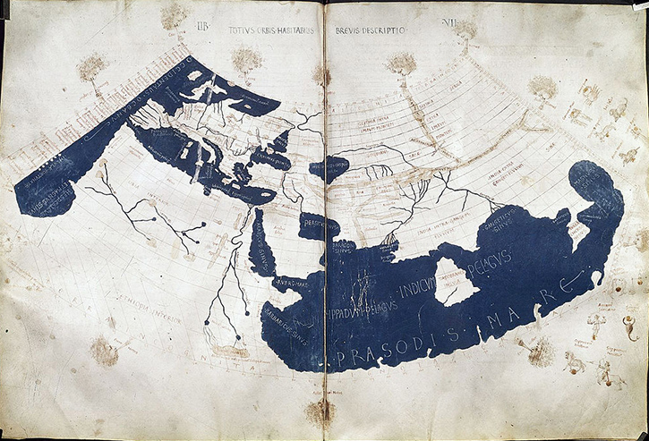
One interpretation of Ptolemy's atlas produced in the fifteenth century is more of a map of Europe than the world. The map stretches from present-day Spain in the west to a small portion of China in the east. The shape of Europe is loosely correct, but some countries, like India, appear more squat. The northern portion of Africa is relatively close in shape, but it quickly morphs into a vague suggestion of further territories to the south. Text towards the bottom of the African continent reads 'terrain incognita', indicating unknown lands.
Outside of the practicalities of making maps, artists sometimes flexed their creative muscles when designing cartouches and compass roses. Cartouches are the decorative areas surrounding maps and the compass rose typically helps orient the viewer with the cardinal directions.
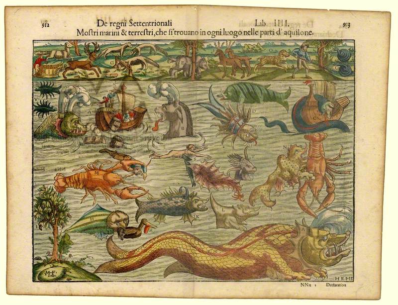
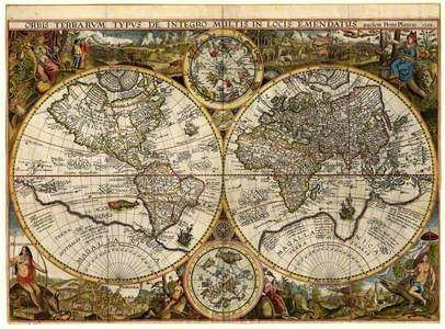
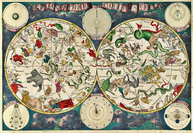
Orbis Terrarum Typus (Double Hemispheric World Map)
1594
Jan van Doetichum the younger (d.1630) 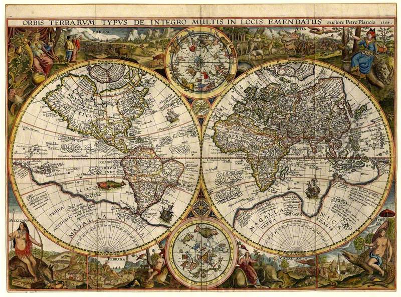
'You'll get all sorts of artistic representations of wonderful things. It could be classical scenes and nautical scenes,' says Nick. 'Nothing to do with the map's content at all in terms of geography, but a real opportunity for the mapmaker to throw in some spectacular artistic interpretation as to what they're talking about.'
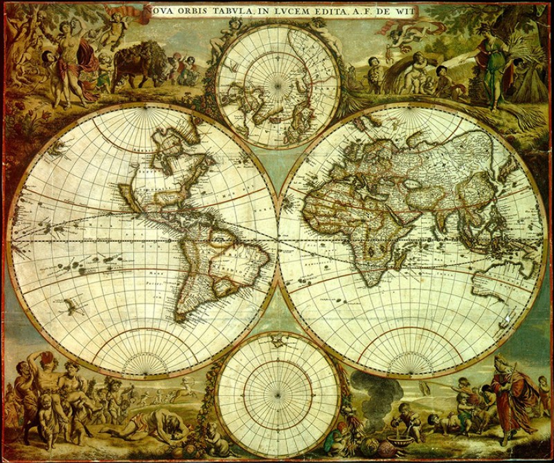
Map showing North and South America, and Europe, Asia and Australia
1660 by Frederick de Wit (1630–1706) 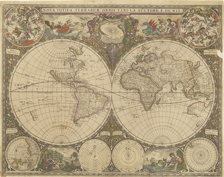
For a spectacular example of the artistry that went into creating some maps, you can look to the work of Dutch cartographer and artist Frederik de Wit. He worked during the height of the Dutch Golden Age and painted maps with elaborate and colourful scenes around the edges. Some show whimsical scenes with mythical creatures, while others show personifications of ideas, such as the four seasons. De Wit even created a vibrant celestial map, showing the animals and figures that represent the major constellations.
Detail of the Sheldon Tapestry in Warwick
16th C by unknown artisst 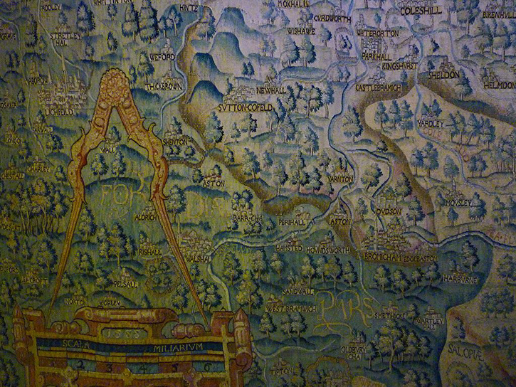
For another creative approach to map-making, we can look at the Sheldon Tapestries. These are four maps that were created around 1590 for a man named Ralph Sheldon. These huge tapestries illustrate the counties of Warwick, Oxfordshire, Worcestershire and Gloucestershire in England.
'They're great big bits of tapestry showing the maps of the counties based on the work of Christopher Saxton, who created the first real county maps of England about 15 years beforehand,' says Nick. 'All the geographical information from these county maps has been converted into these huge tapestries. And he added his friends and his family's houses to these maps, but otherwise they were stunning representations of the Tudor English landscape.'
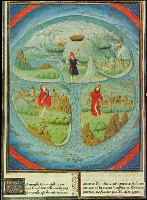
The way maps are designed literally shape the way we see the world. It's easy to see why artists would take the opportunity to express themselves creatively, but maps can also have political and religious implications.
'Certainly, on the religious side, the classic examples are known as 'mappa mundi', or maps of the world, which are medieval world maps created in the Christian world,' says Nick. 'They're not going to help you navigate around the world particularly well because they combine biblical stories and theological takes on the world with the geographical world.'
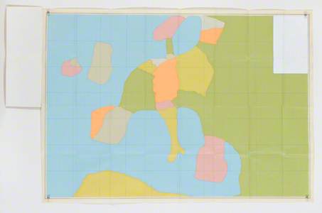
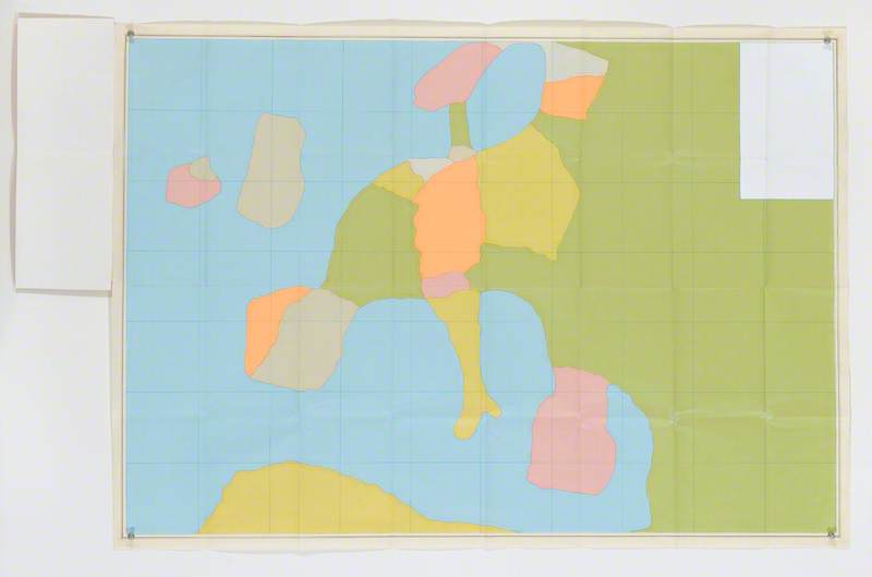
In 2017, the painter Frank Bowling had a retrospective titled 'Mappa Mundi' in Germany, which looked back at some of his bold map paintings. The paintings show outlines of Africa or of North and South America. He plays with scale in these works, representing the southern hemisphere in greater proportions. It challenges the Eurocentric layout of many standard maps. Artworks like these show how meaningful maps can be. Interestingly, many of the examples in this episode would be useless for helping you navigate from place to place, but we've seen that isn't what maps are always about.
'It's very difficult to find an objective map – maps are definitely subjective. There's always an agenda behind the map,' says Nick. 'You look at the map and you take from that what you want. So it doesn't just show you where you are, but it's showing you who you are as well.'
Listen to our other Art Matters podcast episodes